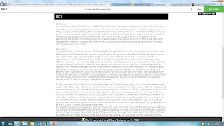
To the left is a screenshot of what the homepage of the website looks like so far, I really like all of the diamonds which are on the page as it looks different. I think it is good that we have stuck to the theme which we chose of quite plain colours which mainly includes blue, white and black.
Gallery
Here is the gallery page, we have included a lot of the photos which we took in the photo-shoot. Once we have done more photos I will add them to this page so it looks more full up and will look even better.


